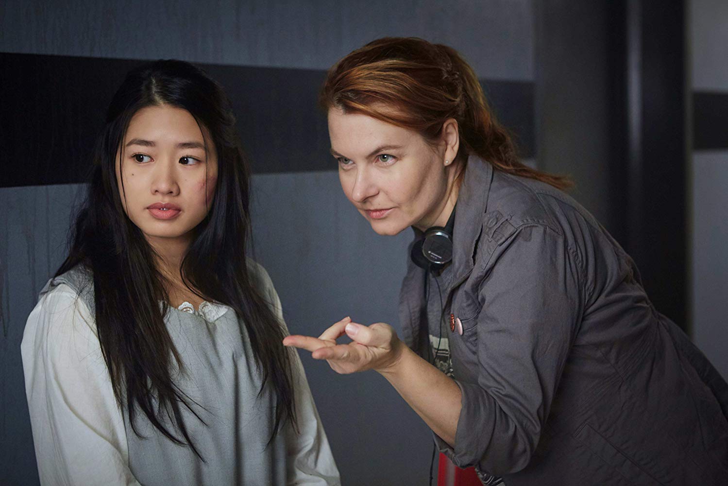
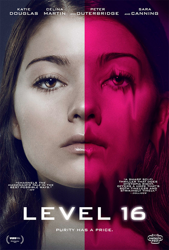
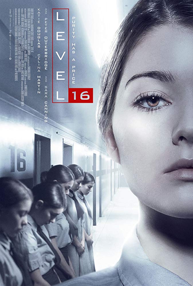
One of my top films from last year’s Fantastic Fest was Danishka Esterhazy’s Level 16 (see my review of the film here). I had a chance to speak with the director after the screening, but as so often happens, after I’d had a time to sit with the film for a while, there were a number of thoughts and questions that arose in my mind. Despite the fact that she has been out of the country working on another project, Danishka took the time to delve a little deeper into the world of Level 16 with me recently.
Note that some of the things we discuss step into spoiler territory, so if you haven’t yet seen the film you may want to bookmark this for later. Level 16 is out now in theaters and on VOD, and hits physical media on April 30th.
After the screening at Fantastic Fest, you mentioned (if I recall correctly) that you had been trying to get Level 16 made for over a decade. Can you tell us about that journey, from writing, to getting the film backed, to shooting, and finally screening the film for audiences?
I wrote the first draft of the script back in 2006 – right after I graduated from film school. I thought Level 16 would be my first feature. But the project faced so much resistance, and the funding was so difficult to secure, that it ended up being my third feature. I wanted to make science fiction films and horror films. But I was told, again and again, that genre films with a female perspective were simply unmarketable. Which is ridiculous. But it has been a long journey from first draft to finally making the film. A journey of over a decade. But, perhaps, that made the release of this film more satisfying. And to find such a warm audience response has been vindicating.
It’s apparent that a lot of care went into the design of the film – the costuming, sets, and media referenced throughout the film all support the story you’re telling, and many of the smaller details may only be noticed by audiences on a second or third viewing. How closely did you work with your set and costume designers to create the world of the film?
The design started from a strong place – because I had been living with the story in my head for so many years. I had written numerous backstories and timelines and so I had a lot of detail that I was able to give to my team. I always start with a “Director’s Bible” of background material and references. The Level 16 bible was huge. But it takes a team of talented artists to make a film. I was very lucky to have Production Designer Diana Magnus and Costume Designer Jennifer Stroud on my team.

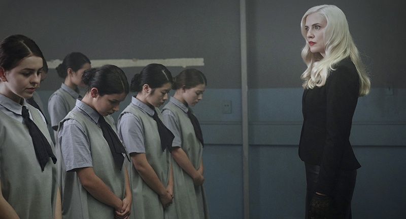
Additionally, the look of the film changes as the girls progress through the various levels. While they are being told that this is a prestigious advancement, their surroundings don’t really reflect this. Wallpaper peels from the walls, and the power goes out periodically. I’m sure this is no coincidence. Was this meant to further demoralize the girls and render them more pliable to the idea of being “adopted”?
In my mind, Miro and Brixil are struggling to eke out a profit from their facility. Miro’s work requires years of investment – and they are forced to give a cut of their income to the local mafia in order to maintain hidden from the law. So, Miro and Brixil have reduced all expenditures to the absolute minimum. They only spend money when absolutely necessary. As a result, comfort and even building maintenance have been sacrificed. And, of course, as a hidden black market facility, they can’t hire help easily – which makes issues like building repair even more difficult.
The cinematography also plays a huge role in the look and feel of the film. I was particularly taken by the cool blue and teal tones used for most of the film (reminiscent of films like Battle Royale and The Matrix), in contrast to the more natural look when we catch glimpses of the world reserved for characters like Dr. Miro and Miss Brixil. Were there certain films or cinematographers you referenced in approaching how you wanted the completed film to look?
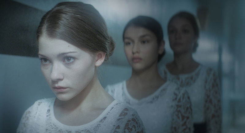
The color palette was developed through discussions with my Production Designer Diana Magnus. We wanted to create a kind of character arc for the building – for the Vestalis Academy. An arc that would reflect how Vivien feels about the school. So, in the beginning, the colors are very cool and clean. Lots of blues and grays; very desaturated. Then, as Vivien begins to question the school, the colors become more saturated, more complex. Teals and greens appear. When Vivien starts to openly rebel, we see yellow and then, eventually, red appears in the palette. The private apartment has the only window in the movie and it represents a different part of the world – a place that Vivien has never experienced. So the colors in that set are warm and golden and earth-toned.
For visual inspiration, I drew on some of my favorite science fiction movies, which did include The Matrix. I love those Neo greens. But I was also inspired by Gattaca, THX 1138, Ex Machina, Logan’s Run, and Stalker. And I used a lot of negative space to reflect Vivien’s emotional isolation. Lots of lower quadrant framing and short-sighting. Once Vivien and Sophia begin to connect, I used more traditional framing and eyelines to underscore their deepening friendship.
The characters and entities in Level 16 often have names that hold a deeper meaning. The Vestalis Clinic brings to mind the Vestal Virgins, who were ultimately called to sacrifice their lives for the benefit of others. The girls are all named after actresses from the golden age of Hollywood. I’ve had a little more difficulty placing the names chosen for Miro and Brixil. Can you give me some insight into the names chosen for these characters, and for the cast in general?
Yes, the Vestal Virgins of ancient Rome were definitely an inspiration. Especially the way that disobedient Vestals were punished – by being walled up alive. In a way, the girls of Vestalis are walled up. Entombed.
And the girls are named, by Miro, after actresses from the golden age of Hollywood. Vivien Leigh. Sophia Loren. Ava Gardner. Rita Hayworth. Miro loves old films, loves glamourous actresses from the past, and so he has created a world that reflects all of his favorite things. It is quite twisted. He has a kind of god complex.
Miro is named after a charming older gentleman that I once knew. He was very intelligent, quite dashing, and had an old world flair about him. He passed away several years ago but I have always loved the name Miro.
Brixil is not the real name of the headmistress. It is the pseudonym she has adopted to hide her identity while interacting with “patrons” at Vestalis. An additional step to protect herself from the illegal activities at the Academy. It is a name inspired by a topical medicine used to treat skin cancer – which, for many reasons, seemed apt.
The film is unashamedly feminist, though the story it tells gets these points across without being superficially preachy or political. I believe that even a good portion of people who might shy away from a film labeled such will find plenty to enjoy here. With the history of bringing the film to fruition, what do you believe it is that made our current social climate the perfect time for Level 16 to be realized?
I love science fiction, and especially dystopian fiction, because of the social issues that lie at the heart of the stories. These are genres which hold up a mirror to our society by imagining where our current moral choices could lead. But, yes, no one wants to be lectured. Good science fiction engages our empathy through memorable characters.
And timing is everything in the film industry. For many years, I was told that feminist dystopia was an untouchable genre because the 1990 film adaptation of The Handmaid’s Tale was a flop. One film! Ridiculous. But, thankfully, the birth of YA showed that films with young women in the lead could perform well. And then the success of the television adaptation of The Handmaid’s Tale proved that feminist dystopian stories can be very successful. So, finally, the industry was ready to give Level 16 a chance. I think the film would always have found an audience. But finding the funding – that was the tricky part.
Level 16 doesn’t revel in blood and gore, but it doesn’t shy away from it either. I’ve been a horror fan for most of my life, but I’ll admit to cringing all three times I have watched the film when a certain character is disfigured. Can you tell us a bit about your approach to the gorier aspects of the film?
I am not afraid of blood and gore. But every narrative element in Level 16 was character- driven. I wanted to stay close to Vivien and see the world through her eyes. There were other scenes, which Vivien does not witness, which I could have included in the film. Violent and extremely bloody scenes. But I did not want to include those just for shock value. I think that choice makes the climactic scene more powerful.

Another element of the film that immediately stood out to me was the score by Menalon. The score recalls classic sci-fi and horror scores from the likes of Vangelis and John Carpenter without falling into slavish imitation. The music is also woven so deftly into the film that it never distracts from the images on screen, stepping forward when needed and slipping slightly back when appropriate. Tell us a bit about your work with the composers. Were there specific scores you had when mind when you were envisioning the music you wanted to accompany the film?
I love 80s synth scores. I love Vangelis and John Carpenter. When I start a screenplay, I always create a playlist to listen to while writing. While writing Level 16, I was listening to Blade Runner and Escape from New York. For my score, I wanted a dark electronic sound that reflected those classic scores but that also sounded updated – very minimalist and modern. Something plaintive but also industrial. Menalon was a perfect choice because so much of their music already has a dark ambient electronic sound. For Level 16, they used a collection of vintage 90’s digital synths like the JV1010. And they built a sample library of 80s synth sounds for the film. The result is perfect blend of dark, moody and menacing.
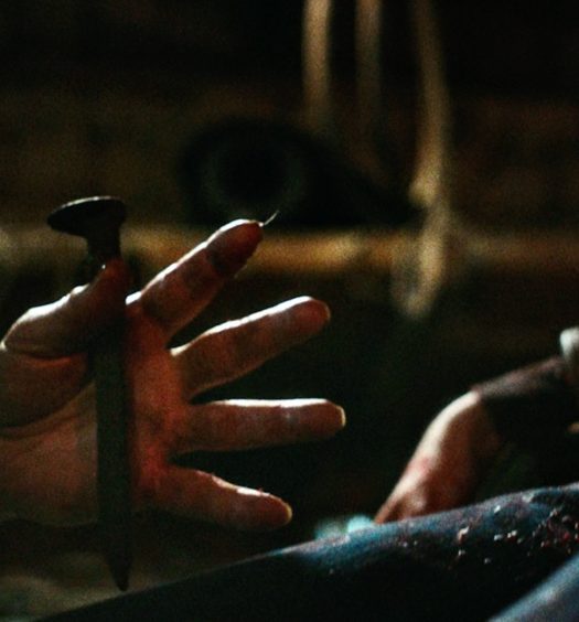
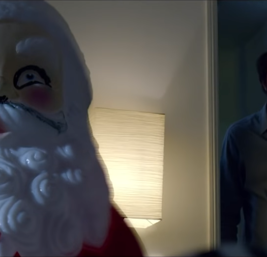
It has recently been announced that you’re working on a horror film based on The Banana Splits. While this may seem a bit strange to some, my mind immediately went to a nightmare place. I can totally see this being scary. Is there anything you can tell us about your approach to this material, and what we can expect?
I loved the idea behind The Banana Splits – the idea of taking a beloved and “safe” children’s show and turning it into a nightmare. Because a lot of children’s television is unintentionally creepy. And there is something about the design of the original Banana Splits characters that is innately unsettling. So, it was not a huge stretch to take that creepiness and turn it into horror – very graphic horror. It gave me the opportunity to explore a kind of faded psychedelic style, and to build a color palette inspired by great 1970s films like Don’t Look Now. I think people will be surprised by this film. It is very dark and very funny.
The Author
You Might Also Like